
New logo for a new city
06 Feb 2019
Newcastle Art Gallery, Civic Theatre, Blackbutt Reserve and other city jewels have been united under a new corporate logo to reflect Newcastle's revitalisation and ensure Novocastrians are aware of the assets they collectively own.
A multi-coloured ‘N’, the main feature of the new City of Newcastle logo, was inspired by the emergence of a new city and designed to promote its growing appeal to tourists.
 New logo on a blue background.
“All of our facilities and services will be united under a single banner that Novocastrians can be proud of,” Lord Mayor Nuatali Nelmes said at today’s launch.
“The new ‘N’ logo bears seven colours in a simple yet effective design that encapsulates Newcastle as an emerging global city. The ripple effect represents water, as a strong symbol and shared connection across our coastal city. The vibrant palette captures the beauty of Newcastle’s natural environment and represents the city’s bright outlook.
“The look proudly complements our highly successful Newcastle ‘See Change’ destination brand. The two will often feature side by side as we work to deliver services and facilities to Newcastle as well as promote the city as a destination.
"Through consultation with our community for our Newcastle 2030 Strategic Plan, we found that our coastline was an important element to the Newcastle region and our fresh brand reflects this.”
Research undertaken last year found around half of all Novocastrians weren’t aware Blackbutt Reserve, Fort Scratchley, the Civic Theatre, Newcastle Museum or Newcastle Art Gallery were City of Newcastle facilities.
 The new logo on a white background.
An updated, more contemporary logo was needed, the Lord Mayor said, a quarter of a century after the Civic Fountain motif replaced a coat of arms bearing two seagulls.
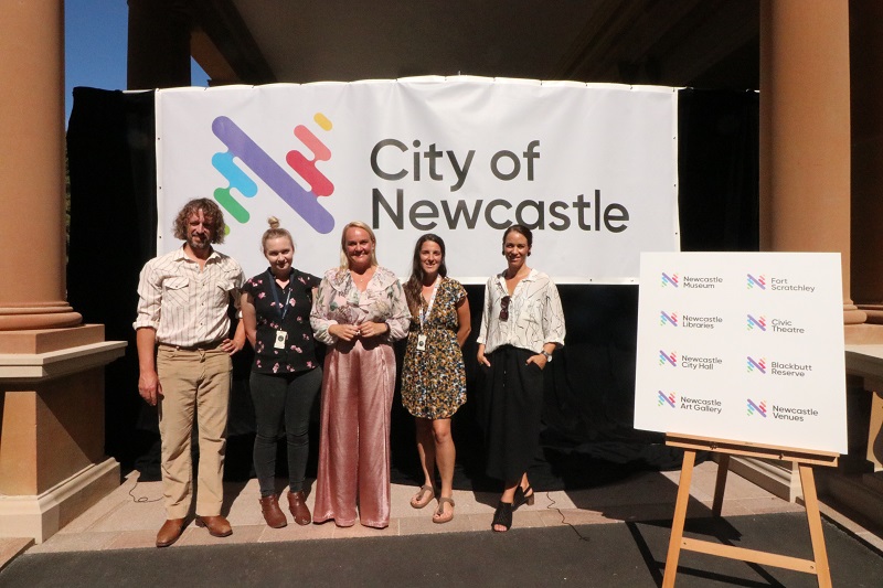 Lord Mayor Nuatali Nelmes flanked by members of the City's creative team at this morning's logo unveiling.
“As a progressive, dynamic and rapidly changing City, it was important that we made this change to complement Newcastle’s transformation from a regional town into a smart, liveable and sustainable global city,” Councillor Nelmes said.
“When our community doesn’t recognise the services or facilities their local council provides, it’s clear that the old approach of separating council’s services and logos for each asset was not optimal. Under the new ‘N’, we are united with a consistent and recognisable symbol.”
CEO Jeremy Bath said he expected the new brand would engender a greater sense of city pride and ownership following its gradual roll out.
“We’ve brought together elements such as our affinity for water into a functional design that is bold and instantly recognisable,” Mr Bath said.
“And with our in-house design team partnering with local creative agency Headjam in a co-design capacity, along with some in-kind support from the agency, we were able to minimise the spend without compromising the result. This assistance to develop the design for our organisation, and all facilities cost just under $50,000.
"With the foundation design work done, we can start a 12-month implementation phase.
“While we intend to roll the brand out in a timely fashion, we won’t be replacing our 25-year-old brand overnight. We’ll start by replacing existing signage on our big-ticket items, like prominent sites and cultural facilities, before progressively rolling-out any new signage when it’s due for replacement under our routine signage renewal work.”
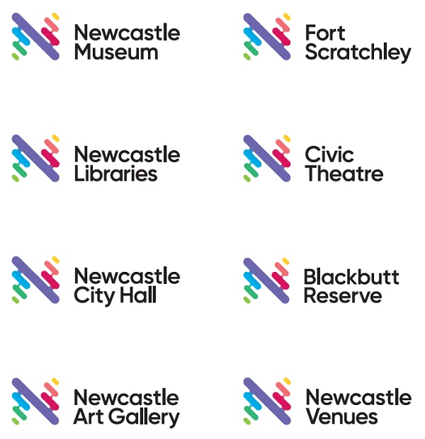 New logos of City of Newcastle facilities.
The timing of the brand refresh coincides with the City’s administrative move, from three separate Civic precinct buildings to a single office block in the City’s new CBD in Newcastle West.
As the above image shows, the new ‘N’ logo will feature on all City of Newcastle assets including the Civic Theatre, Newcastle Art Gallery, Newcastle Museum, Newcastle Libraries, Fort Scratchley, Newcastle City Hall, Newcastle Venues and Blackbutt Reserve.